How Color Psychology Affects the Way We Receive Gifts
When we think about the perfect gift, we usually focus entirely on what is inside the box. We spend hours scrolling through online stores, reading reviews, and trying to track down an item that perfectly matches our recipient’s personality. But as a professional event planner and luxury gift curator for over eight years, I have learned a fascinating truth that completely changes the gifting game: The emotional experience of receiving a gift begins long before the wrapping paper is actually torn off.
In fact, it begins the exact millisecond your recipient lays eyes on the package.
Human beings are intensely visual creatures. Psychological studies show that up to 90% of our snap judgments about products and environments are based on color alone. This phenomenon is known as color psychology, and it plays a massive, hidden role in how gifts are received, perceived, and valued. The color palette of your wrapping paper, the ribbon, and the gift itself acts as an emotional primer—quietly telling the recipient’s brain how to feel before they even know what they are holding.
If you want to elevate your gifting strategy from generic to unforgettable, understanding this secret visual language is essential. Here is a deep dive into how color psychology shapes the gifting experience and how you can use it to your advantage.
1. The Science of the First Impression: Emotional Priming
When someone hands you a gift, your brain instantly goes to work analyzing the visual cues. This is called emotional priming. Different colors trigger specific neural pathways, releasing hormones like dopamine (the reward chemical) or oxytocin (the bonding chemical).
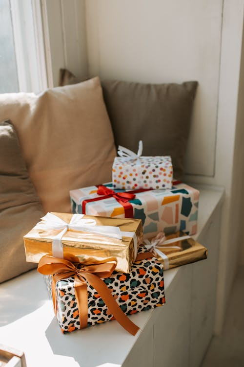
If you wrap a gift in a chaotic, mismatched set of neon colors, you might inadvertently trigger a subtle wave of visual anxiety in the recipient. Conversely, if you choose a cohesive, scientifically backed color scheme, you can induce feelings of calm, nostalgia, or intense excitement. By intentionally selecting your colors, you control the emotional narrative of the exchange.
2. Decoding the Gift-Giving Color Spectrum
Every color carries its own distinct psychological baggage. Here is how the most common colors impact the human psyche during a gift exchange.
Red and Crimson: High Energy and Urgency
Red is a physiological stimulant. It literally increases the viewer’s heart rate and respiration. In the world of gifting, red screams passion, excitement, and deep emotion. It demands immediate attention.
- The Psychological Impact: It creates a sense of thrill and anticipation. The recipient feels that whatever is inside is high-stakes and important.
- Best Used For: Romantic partners, major festive holidays (like Christmas), or high-energy celebrations.
Blue and Slate: Trust, Serenity, and Professionalism
Blue is the universal favorite color across the globe, primarily because it activates the parasympathetic nervous system, inducing a physical sense of calm and stability.
- The Psychological Impact: It lowers expectations of chaos and establishes a feeling of safety and trust. A blue gift feels reliable, thoughtful, and sophisticated.
- Best Used For: Corporate gifting, professional mentors, or friends who are currently going through a stressful period in their lives.
Sage and Emerald Green: Wellness, Growth, and Fresh Starts
Green is heavily tied to nature, health, and psychological renewal. It signals to our primitive brains that an environment is safe, abundant, and fertile.
- The Psychological Impact: It evokes a sense of balance, organic luxury, and peace. It feels nurturing and restorative.
- Best Used For: Housewarming gifts, wellness care packages, or baby showers.
Gold, Black, and Charcoal: Prestige and Exclusivity
In color psychology, black and metallic gold represent power, luxury, and mystery. Black conceals, creating a high level of intrigue, while gold reflects success and high worth.
- The Psychological Impact: It instantly elevates the perceived monetary value of the gift. The recipient automatically assumes the item inside is premium, exclusive, and curated with extreme care.
- Best Used For: Milestone birthdays (like a 30th or 50th), luxury corporate clients, or formal gala events.
3. Real-Life Experience: Disarming a Stressed Colleague with Color
To see color psychology in action, look no further than the corporate world. A few years ago, I was managing a highly chaotic, multi-day tech conference. My co-lead on the project was a brilliant project manager named Amanda. By day three, Amanda was running on two hours of sleep, dealing with angry vendors, and visibly drowning in workplace stress.
I wanted to surprise her with a thoughtful “survival gift” to thank her for her incredible grit. I put together a premium care package: a high-end aromatherapy diffuser, premium essential oils, and a luxurious silk eye mask.
Now, because it was the holiday season, my instinct was to wrap the entire bundle in a bright, festive, glossy red paper with a massive metallic gold bow. But right before I cut the paper, I stopped myself. Amanda’s nervous system was already completely overloaded. Handing her a bright red box would visually scream “URGENT! LOOK AT ME!”—adding more psychological noise to her day.
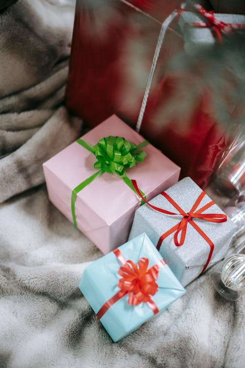
Instead, I pivoted. I wrapped her gift in a matte, soothing sage green paper, tied it with a soft, textured cream cotton ribbon, and tucked a small sprig of fresh dried eucalyptus into the knot.
When I walked up to Amanda’s desk and handed it to her, I watched her physical reaction change in real-time. The moment her eyes hit the soft green and cream palette, she let out a massive, audible sigh of relief. She hadn’t even opened the box yet, but her shoulders visibly dropped.
“Oh my gosh, Lily,” she whispered, running her hand over the matte paper. “Just looking at this package makes me feel like I’m at a spa. It is so calming.”
By aligning the color of the wrapping with the emotional state she needed to be in, the gift was a massive success before she even saw the diffuser inside. That is the power of experiential color psychology.
4. The Color Psychology Gifting Matrix
To make your next shopping and wrapping trip completely seamless, use this scannable reference matrix to match your gift’s purpose with the perfect psychological hue:
| Wrap/Gift Color | Primary Psychological Trigger | Perceived Value Concept | Best Emotional Scenario |
| Matte Black + Gold | Exclusivity, Luxury, Mystery | Extremely High / Premium | Celebrating a promotion or a luxury milestone. |
| Sage / Forest Green | Peace, Restoration, Nature | Thoughtful / Wholesome | Comforting a stressed friend or a new homeowner. |
| Soft Pastels (Pink/Lavender) | Nurturing, Gentleness, Comfort | Intimate / Sweet | Baby showers, Mother’s Day, or expressing sympathy. |
| Navy Blue + Silver | Stability, Trust, Logic | Professional / Sophisticated | Corporate exchanges, gifting a boss or a new client. |
| Vibrant Orange / Yellow | Optimism, Energy, Fun | Playful / Casual | Graduation parties, kids’ birthdays, or a fun summer party. |
5. Practical Rules for Applying Color Psychology to Your Gifts
Now that you know the science, here are three actionable rules to apply to your wrapping routine to ensure your gifts hit the right emotional note every time:
- Balance the “Inside” with the “Outside”: If you are gifting a highly energetic or loud item (like a colorful party game), balance it by using a slightly more grounded, solid-colored wrapping paper so the recipient isn’t overwhelmed. Conversely, if you are giving a practical, plain item (like a grey tech organizer), use a pop of vibrant yellow or metallic ribbon to inject a sense of fun and celebration into the exchange.
- Consider the Recipient’s Environment: Always think about where the gift will sit before it is opened. If you are bringing a housewarming gift to a friend who loves a minimalist, Scandinavian, neutral aesthetic, avoid wrapping their gift in bright purple. Match their environmental palette to show you truly understand their tastes.
- Never Underestimate Texture: Color psychology works hand-in-hand with tactile psychology. A matte paper feels more organic and modern; a glossy paper feels traditional and celebratory; a velvet ribbon adds instant luxury.
Conclusion
Gifting is an art form rooted in human connection. While the item inside the box will always matter, the visual wrapper is the map that guides the recipient’s emotional journey. By mastering the hidden language of color psychology, you stop giving generic items and start creating curated, therapeutic visual experiences. The next time you prepare a gift for a friend, a loved one, or a coworker, take a moment to ask yourself: What do I want them to feel the second they look at this box? Let that answer choose your palette.